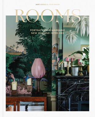
Photographer Jane Ussher is well known for her ability to make even the most hesitant or nervous characters come to life in front of the camera. For 30 years the award-winning photographer worked at the NZ Listener, photographing a who’s who of New Zealand politics including Robert Muldoon, David Lange, and Helen Clark. When she made the move into interior and architectural photography following her departure from the NZ Listener in 1997 she didn’t leave her love of people aside.
“When I walk into a room that interests me, it’s like meeting a person that interests me,” Jane told John Walsh in the forward of her new book Rooms: Portraits of Remarkable New Zealand Interiors.
This stunning book features 300 plus colourful homes filled with personality.
Jane caught up with habitat for a quick chat about the process creating this book, which is proudly supported by Resene.
habitat: One of the striking things about it is that the imagery is full page with very little captions. Can you tell us the thought process around that design?
Jane: We really wanted the reader to come to their own views about each room and actively look at the images without any editorial set up or foreshadowing that would direct their focus and reaction. This means that each image is open to a unique reaction from each and every reader. Readers are telling us that they really appreciate this.
As a photographer do you think about how readers look at the rooms - how do you hope they will ‘read’ the images?
Jane I hope that they will look at the rooms the way I look at them through the back of my camera. I have it set up on a tripod, often with a very long exposure, and I am very focussed on the way the image is framed. I am confident that this will lead their eye through and into the room and that they will then fully scan all parts of the image, working first from a general survey and impression and then turning to the finer detail and think ‘What is on the table in the corner?’ for example, or ‘What is the painting at the very back of the room?’
When talking to the homeowners, how did you decide which rooms you would feature?
They would often tell me the room of which they were most proud or that they would be comfortable that I shot, but sometimes I would take a bit of a wander through the house and ask whether I might set up my camera elsewhere. There is definitely a preponderance of living or sitting rooms as this is where most people put the most effort into staging their collections and arranging their art and furniture. I also shot a lot of hallways as these are often extremely interesting areas, especially of older houses, where there is an opportunity to set up a vista and sense of adventure as you move deeper into the house.
Colour is a huge part of this book - How can colour transform an interior/room?
It is huge part, and in fact the entire book is organised around a colour wheel and flows from tones of reds and browns through into blues and yellows, pinks and greens, whites and creams and so on.
All of these homeowners were incredibly confident with colour and all of them had got things absolutely right. Some of their decisions were really bold and even where it was white, cream or grey it was just the right tone. These aren’t spaces where the owners follow trends and in many cases their collections of art, sculpture and furniture helped define the colour of the rooms.
Read the full Q&A here.


